Showing posts with label DESIGN. Show all posts

13.3.15

FORMAT15 Festival


It's been a pleasure to work with the Format team this year on the festival guide and signage, and with QUAD on the education guides. Format is in it's 10th year and presents a selection of the best of international photography in a diverse programme of exhibitions and events.
This year's festival has an extensive calendar of exciting events and exhibitions in a range of venues across the city. The guide was designed so it was small enough to fold down and fit in your pocket, making it easy for festival goers to navigate their way around the city. With such a fully packed festival we had a lot of information to fit in, so we tried to create a guide that was easy to read and access and that would inspire people to visit the fantastic exhibitions and events!


A Z-Card format was chosen for an easy to use guide on the go

Commissioned by QUAD to create an educational guide to the festival for children, we designed two brochures; one for Key Stage 1/2 and another for older children (Key Stage 3+).

The theme of this year's festival is 'Evidence' so we had a lot of fun designing a guide in a Detective/Secret Agent style. The brochure takes the children around the exhibition, encouraging them to think about and discuss the photos on display aswell as participate by completing activities based around the artworks.

The back page includes a secret agent disguise kit that you can cut out and wear while you're sleuthing! (Much fun was had in creating this particular page as it was necessary to try out the glasses, eyebrows etc to check the sizes were correct, at least that's what we told our designer Tom as we made him wear them!).


Education brochure for Key Stage 3+ 
A more minimalist, contemporary design was created for older students, each page detailing an exhibiting artist and encouraging discussion and further research.


If you fancy a trip to Derby, come and check out the huge amount of fantastic artwork by international photographers, the talks, the tours, film screenings, not to mention the amazing locations all across the city and it's on until the 12th April! Find out more and download the guide on the Format website.

22.2.15

A new look for the Sally Montague Hair Group


For the past few months Firecatcher have been working closely with the fantastic team at Sally Montague to create a refreshed brand identity and an innovative new website, of which we're extremely proud!

The website allows visitors to enter the behind-the-scenes world of the Sally Montague Hair Group at the touch of a button. Features include detailed expert styling tips, industry knowledge and product advice; the latest news, events and seasonal trends as they happen; the monthly exploits of the talented, award-winning Sally Montague Art Team; and exclusive footage from backstage at high-profile Fashion Weeks, all designed to keep clients better connected and up-to-date with the latest news.
The new digital image for the group goes one step further with the addition of a new, bespoke, mobile-friendly version of the website, enabling clients with a busy lifestyle to keep up-to-date with all the latest Sally Montague Hair Group news on the move.
In addition to the new website, we created a new, contemporary logo. An evolution of a well known and established brand to bring the overall look in-line with the group's key attributes of creativity, innovation and sophistication. The new branding will appear on all business stationary including business cards, client receipts and letterheads, and all online material.
Group director, Sally Montague, commented: “The Sally Montague Hair Group is always looking at ways to improve the client experience. Alongside our fresh new logo, the new website is forward-thinking, user friendly and technically savvy. Having a continuous connection with customers will generate new interest in our salons and increase brand loyalty.”

You can check out the website and book an appointment here!

30.11.14

See you in the Spa!

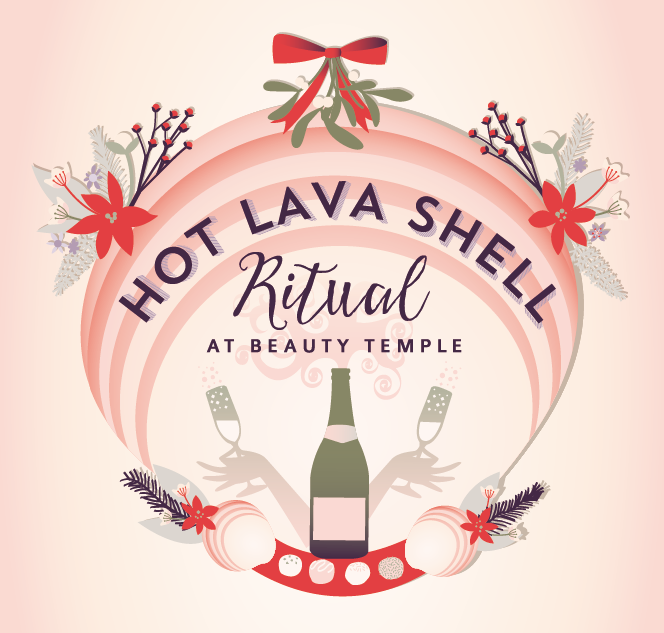
We love working with Beauty Temple and Owl House Spas, based in Derbyshire and Nottinghamshire, as not only are their offers so enticing, but they also allow us to get creative with their marketing materials! Here are a few pieces we've loved working on this year... Why not give them a call and book in a relaxing treat?!


9.5.14

Derby Film Festival Launches!


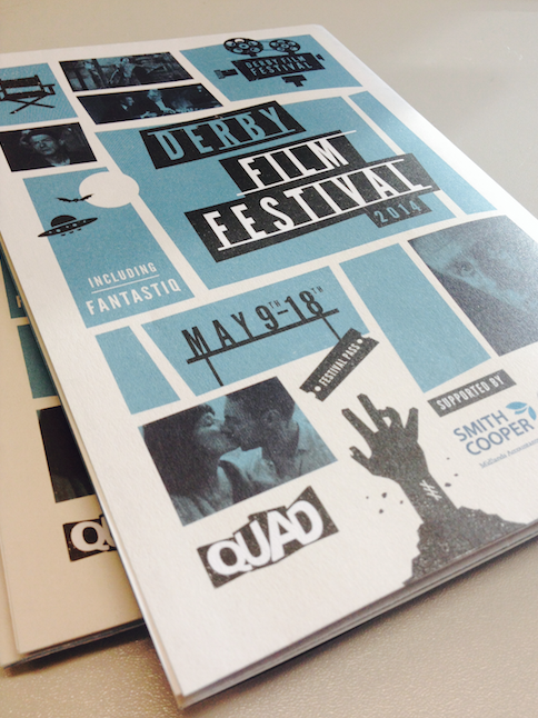
After working on ID Fest for 4 years, we were absolutely thrilled to be asked to work on the next iteration for the wonderfully creative film festival held at QUAD every year.  Now simply called 'Derby Film Festival', this ten day celebration of film is sure to be a wonderful event!  Special guests include the inimitable John Hurt, Phil Davis plus lots more!!

Our approach to the project was inspired by the work of the legendary Saul Bass, whose graphic design for opening sequences was so integral to the movie industry in the 1950s & 60s, working with greats such as Hitchcock, Billy Wilder, Stanley Kubrick and Martin Scorcese.  This look is still as relevant and popular today as it was then.  We felt this, along with a limited colour palette and bold typography created a strong brand identity for the festival that exuded intrigue, fun and entertainment, whilst being a contemporary and innovative place to celebrate the movie industry.

The website with the full festival programme can be viewed here.

16.4.14

Summer Nights Film Festival 2014


We were thrilled to be asked for the third year running to create the marketing materials for the 2014 Summer Nights Film Festival, run by QUAD, Derby.  This year we were excited to create a dedicated website for the festival, allowing visitors to book tickets, find out what's on and get useful information for their visit.  Using the wonderful photography by Graham Lucas Commons, we're so proud of this scheme and can't wait to kick back with a picnic basket in front of one of these fantastic films!

Visit summernightsfilm.co.uk for a list of all the films and info on how to bag your seat!

Click here to view an online version of the brochure.

10.12.13

A Celebration of 3D and Physics


We had a lot of fun working on the 3D brochure, mainly through the wearing of the red/cyan goggles to check our stereograms were working!  This fantastic season of films, talks and exhibitions from the irrepressible QUAD in Derby was complemented with a 3D trail exploring the theories of gravity...


These small stickers were placed throughout the gallery and allowed visitors to learn a little about gravitational theories from Newton onwards, and all in 3D!  

1.11.13

Charity Christmas Card Design - Cure Rett


We were extremely proud to be asked to design this year's Cure Rett Christmas Card!  After working with the fantastic people at the Olive Beaumont Foundation we have been really interested in helping to raise money for the charity Cure Rett, working towards finding a cure for Rett Syndrome, a devastating brain disorder affecting predominantly young girls.  We designed the above cards, using a limited colour palette and lovely brown paper.  Hopefully they will play their part in raising money for this amazing charity.  To find out more about Rett Syndrome, visit www.curerett.org

1.9.13

Wibbly-wobbly-timey-wimey stuff at QUAD, Derby


We've just had lots of fun producing a mini brochure for QUAD, celebrating the upcoming Time Travel Season, featuring art, movies, talks and more on the subject of the wibbly-wobbly, timey-wimey stuff.  We created tiny circular cogs that sent straight timelines off in a more curvaceous route.  Is that a TARDIS materializing we can hear..?

30.8.13

An exclusive new brand goes live!

Over the past month we have been creating a brand identity for Angel Montague Sayers, an emerging and award winning talent in the session styling world, working for leading brands such as L’OrĂ©al Professional, Vogue and Elle magazine to name just a few and at fashion week shows in London, New York, Milan and Paris.

It was important therefore that we designed and positioned a brand that belongs in this exclusive market place. With this is mind we set about creating a brand that would be seen as a mark of creativity, craftsmanship, high quality and distinction.
Clean, modern linear lines form together to create the symbol, whilst a subtle icon in the form of a pair of scissors gives a subtle yet distinctive suggestion to her profession. Finally the classic typeface chosen displays an elegance and sophistication that is paramount to the brand.

The overall result is a contemporary brand identity that is both, refined, and elegant, with a view to longevity in mind.

Following on from this we have designed a new portfolio website for all of Angel's latest work and a view behind the scenes into her world as a session stylist. With fashion week shows just around the corner the website will act as a great primary touch point and a highly professional showcase. 
Visit the website < here >

3.7.13

Summer Nights Film Festival

We were so pleased to be once again asked to design the artwork for the annual Summer Nights Film Festival in Derby.  This outdoor cinema festival has grown again this year, featuring some fantastic films such as Skyfall, The Dark Knight Rises and Les Miserables.


Working with the logo designed last year, we developed the look and paired it with the fantastic photography of Graham Lucas Commons (click here to visit his website) to create a dreamy, summery feel to leaflets, banners and flyers.


17.6.13

30 years of the National Media Museum

We were very excited to be given the task of designing a visual identity for the National Media Museum's 30th Birthday celebrations, not least because it opened on the exact same day our very own Bex was born!

We came up with a bright, celebratory style logo, using film reels to embellish the 30 and a vibrant colour palette to be seen throughout the museum.  The identity was used across balloons, t-shirts, badges, bunting, as well as posters and banners throughout the museum.


 We spent the day exploring the museum and created a range of supporting illustrations of several of the key objects within the space, from Daleks to cameras, to the Big Ben microphone responsible for the 'bongs' on the radio during the 50s and 60s, to Thunderbirds and Wombles...


The design was used across a range of design assets, including flyers, posters and banners.  We worked closely with the curators to produce a number of 'trail markers', highlighting 6 of the key objects that visitors were to discover upon their next visit.


We also produced a 4m x 2m wall graphic that was installed in the foyer of the museum.  This details the key events in the museum's history, as well as some of the celebrations in store over the coming year.  Firecatcher wishes the Media Museum a very happy 30th birthday and a successful 2013!

8.6.13

Saltaire Arts Trail - 2013

Firecatcher were privileged to be asked to brand the Saltaire Arts Trail for a second year. A pleasure to work on, the trail celebrates visual arts in and is held in the World Heritage Village of Saltaire, West Yorkshire. We produced everything from the event packed brochure, to posters, banners and maps, right down to the children's activity stickers (this year featuring a rather cute alien!). Below is a small selection of our work this year...