9.5.14

Derby Film Festival Launches!


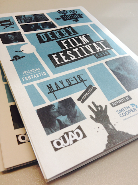
After working on ID Fest for 4 years, we were absolutely thrilled to be asked to work on the next iteration for the wonderfully creative film festival held at QUAD every year.  Now simply called 'Derby Film Festival', this ten day celebration of film is sure to be a wonderful event!  Special guests include the inimitable John Hurt, Phil Davis plus lots more!!

Our approach to the project was inspired by the work of the legendary Saul Bass, whose graphic design for opening sequences was so integral to the movie industry in the 1950s & 60s, working with greats such as Hitchcock, Billy Wilder, Stanley Kubrick and Martin Scorcese.  This look is still as relevant and popular today as it was then.  We felt this, along with a limited colour palette and bold typography created a strong brand identity for the festival that exuded intrigue, fun and entertainment, whilst being a contemporary and innovative place to celebrate the movie industry.

The website with the full festival programme can be viewed here.

16.4.14

Summer Nights Film Festival 2014


We were thrilled to be asked for the third year running to create the marketing materials for the 2014 Summer Nights Film Festival, run by QUAD, Derby.  This year we were excited to create a dedicated website for the festival, allowing visitors to book tickets, find out what's on and get useful information for their visit.  Using the wonderful photography by Graham Lucas Commons, we're so proud of this scheme and can't wait to kick back with a picnic basket in front of one of these fantastic films!

Visit summernightsfilm.co.uk for a list of all the films and info on how to bag your seat!

Click here to view an online version of the brochure.

28.3.14

JBA Consulting Illustrations


We were thrilled to be asked by the lovely people at JBA Consulting to create a series of 12 Art Packs to compliment their 12 service streams and sectors during the redesign of their website.  We visualised the incredible work the company does in research, development, software, training, and consultation within the Renewable Energy, Transport, Utilities and Water sectors.  Using a limited colour palette, the designs gently explained the processes and ideas for the company.  Look out for their re-vamped website soon!

20.12.13

Neonatal Unit Enhancements, Birmingham Heartlands Hospital


Firecatcher were delighted to design a scheme for the Neonatal Ward at Heartlands Hospital, Birmingham. Through a ‘Secret Garden’ theme we explored nature and the idea of the garden being a safe, calm place where things can grow and bloom. We created designs that evoked a sense of calm, curiosity and a feeling of wellbeing with a touch of humour.

Taking inspiration from the Secret Garden book, we created enhancements that would not only decorate the space, but create areas of interest and detail for the parents and the staff who are spending long periods of time in one area. Small details are woven into the leaves for people to spot including little creatures as well as some nice inspirational words and messages of hope.


As well as brightening up the space, a number of enhancements were used as informative devices; encouraging hand washing, presenting health and hospital information, and way-finding.

The colour palette chosen uses a selection of calming, complimentary colours which when used in combination with the neutral wall space create a friendly and contemporary look.


Click here to visit our facebook album and see all the photos.

10.12.13

A Celebration of 3D and Physics


We had a lot of fun working on the 3D brochure, mainly through the wearing of the red/cyan goggles to check our stereograms were working!  This fantastic season of films, talks and exhibitions from the irrepressible QUAD in Derby was complemented with a 3D trail exploring the theories of gravity...


These small stickers were placed throughout the gallery and allowed visitors to learn a little about gravitational theories from Newton onwards, and all in 3D!  

1.11.13

Charity Christmas Card Design - Cure Rett


We were extremely proud to be asked to design this year's Cure Rett Christmas Card!  After working with the fantastic people at the Olive Beaumont Foundation we have been really interested in helping to raise money for the charity Cure Rett, working towards finding a cure for Rett Syndrome, a devastating brain disorder affecting predominantly young girls.  We designed the above cards, using a limited colour palette and lovely brown paper.  Hopefully they will play their part in raising money for this amazing charity.  To find out more about Rett Syndrome, visit www.curerett.org

23.10.13

The Pulvertaft Hand Centre


Located within the Royal Derby Hospital, the Pulvertaft Centre is a specialist hand surgery, treating a wide range of conditions of the hand and wrist. Firecatcher were asked to design a series of enhancements for the Paediatric area, incorporating locations in and around Derby for younger patients to spot, all designed in a bright, contemporary, graphic style.

Our first task was to get out and about with the old sketchbook and camera and gather some research materials!


We decided to use hands as a graphic device to lead the eye around the image, pointing out areas of interest, creating conversation with the viewer whilst performing tasks related to the locations within the designs.

 Hand Studies...
As well as looking at geographical areas of the city, we focused on different areas of interest within Derby life including leisure activities, industry, travel, creative and sporty Derby.

Welcome Wall Enhancements

 Creative Derby...
Leisure time ...
A wonderful project to work on and we've had some great, positive feedback from staff and patients already. You can see all of the photos and enhancement designs here.