13.3.15

FORMAT15 Festival


It's been a pleasure to work with the Format team this year on the festival guide and signage, and with QUAD on the education guides. Format is in it's 10th year and presents a selection of the best of international photography in a diverse programme of exhibitions and events.
This year's festival has an extensive calendar of exciting events and exhibitions in a range of venues across the city. The guide was designed so it was small enough to fold down and fit in your pocket, making it easy for festival goers to navigate their way around the city. With such a fully packed festival we had a lot of information to fit in, so we tried to create a guide that was easy to read and access and that would inspire people to visit the fantastic exhibitions and events!


A Z-Card format was chosen for an easy to use guide on the go

Commissioned by QUAD to create an educational guide to the festival for children, we designed two brochures; one for Key Stage 1/2 and another for older children (Key Stage 3+).

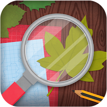
The theme of this year's festival is 'Evidence' so we had a lot of fun designing a guide in a Detective/Secret Agent style. The brochure takes the children around the exhibition, encouraging them to think about and discuss the photos on display aswell as participate by completing activities based around the artworks.

The back page includes a secret agent disguise kit that you can cut out and wear while you're sleuthing! (Much fun was had in creating this particular page as it was necessary to try out the glasses, eyebrows etc to check the sizes were correct, at least that's what we told our designer Tom as we made him wear them!).


Education brochure for Key Stage 3+ 
A more minimalist, contemporary design was created for older students, each page detailing an exhibiting artist and encouraging discussion and further research.


If you fancy a trip to Derby, come and check out the huge amount of fantastic artwork by international photographers, the talks, the tours, film screenings, not to mention the amazing locations all across the city and it's on until the 12th April! Find out more and download the guide on the Format website.

22.2.15

A new look for the Sally Montague Hair Group


For the past few months Firecatcher have been working closely with the fantastic team at Sally Montague to create a refreshed brand identity and an innovative new website, of which we're extremely proud!

The website allows visitors to enter the behind-the-scenes world of the Sally Montague Hair Group at the touch of a button. Features include detailed expert styling tips, industry knowledge and product advice; the latest news, events and seasonal trends as they happen; the monthly exploits of the talented, award-winning Sally Montague Art Team; and exclusive footage from backstage at high-profile Fashion Weeks, all designed to keep clients better connected and up-to-date with the latest news.
The new digital image for the group goes one step further with the addition of a new, bespoke, mobile-friendly version of the website, enabling clients with a busy lifestyle to keep up-to-date with all the latest Sally Montague Hair Group news on the move.
In addition to the new website, we created a new, contemporary logo. An evolution of a well known and established brand to bring the overall look in-line with the group's key attributes of creativity, innovation and sophistication. The new branding will appear on all business stationary including business cards, client receipts and letterheads, and all online material.
Group director, Sally Montague, commented: “The Sally Montague Hair Group is always looking at ways to improve the client experience. Alongside our fresh new logo, the new website is forward-thinking, user friendly and technically savvy. Having a continuous connection with customers will generate new interest in our salons and increase brand loyalty.”

You can check out the website and book an appointment here!

17.12.14

Snowflake Trail launches in Liverpool!

This Christmas we had the awesome job of creating the design and look of the Snowflake Trail in Liverpool, a Christmas treasure hunt throughout the city.  Part of the brief was to create a Jack Frost character and a band of ice sprites who would transform the city centre into a frozen wonderland of festive fun for young and old. 

Organised by Open Culture, we designed a trail map that allowed people to explore the city along the Snowflake Trail, feasting their eyes on sculptures, light projections, street art and magical window displays in some of the city’s best shopping spaces.


The designs used icy blue snowflakes in combination with warm, bright Christmas elements and a hand drawn looking typeface to create a winter wonderland paper cutout effect. The designs have been used across the city, in shop windows, as light projections, as the big Christmas tree surround and as big floor vinyls to point the way!

Rather excitingly we had our first 'Penny Crayon' moment where we saw our Jack Frost character come to life at the Trail launch!! Click here to see some more photos from the launch.

photo by Pete Carr


Character designs of the snow sprites above, trail map and floor vinyl below.


11.12.14

Season's Greetings from Firecatcher!

Wishing you a wonderful, warm, wintry season filled with merriment and joy!  Here are a few freebie gifts from us to you, our chums, for your delectation and delight...


Enjoy this delicious mulled wine with a good Christmas film (we suggest Scrooged or Elf, or The Young Sherlock Holmes, which isn't all that Christmassy, but takes place in winter and is amazing) and of course the ubiquitous gaudy patterned jumper.


https://www.dropbox.com/s/f2idwyjz33m0yen/Gift_Tags.pdf?dl=0 


We've designed some festive gift tags to brighten up your wrapping! Simply click on the image above to download it direct from Dropbox!

We hope you all have a wonderful Christmas and a very happy, very successful 2015!

Sam, Tom and Bex x

30.11.14

See you in the Spa!

We love working with Beauty Temple and Owl House Spas, based in Derbyshire and Nottinghamshire, as not only are their offers so enticing, but they also allow us to get creative with their marketing materials! Here are a few pieces we've loved working on this year... Why not give them a call and book in a relaxing treat?!


24.10.14

A new direction for curerett.org

www.curerett.org


We are very proud to have just launched a brand new website for the charity curerett.org The charity works to raise awareness and funds for Rett syndrome, a rare, genetic neurological disorder that occurs almost exclusively in girls. It effects nearly every aspect of the child’s life: speaking, walking, eating, even breathing.

We're hoping their new website will help them in their mission to raise funds for research for treatments and a cure for Rett syndrome. 


As well as designing the website, we also rebranded the charity; creating a contemporary yet friendly new look with a warm colour palette and a series of characters to take the viewer through the website and various brand touch points. As the girls are very much at the centre of the charity we created a character to be the face of curerett.org, with a group of family and friends around her supporting, raising awareness and fundraising. We are very proud to be a part of this incredible project, and hope the charity goes from strength to strength!

Visit the website by clicking here, and show your support!


24.7.14

New work at the Children's Emergency Department, Royal Derby Hospital

We were recently asked back to the Children's Emergency department at the Royal Derby Hospital to create some artwork for their new paediatric observation unit. We first worked on the ward back in 2010 creating hand painted seaside themed designs. This time, still in the same theme we were asked to incorporate Cedric the seagull, department mascot!

We looked at creating a series of designs which followed 'A day in the life of Cedric Seagull' through a collection of decorative and detailed illustration, allowing the viewer to piece together a story. We also hid a selection of colourful shells within the images so that there were elements the patients could find and interact with.

The designs were printed onto vinyl and wrapped to boards that sat raised slightly away from the wall, creating an interesting installation as you walk down the corridor.


As well as our own designs we were asked to incorporate the work of local school children into the scheme who had been invited to create nautical-themed artwork for the new unit. The hospital staff selected three winners and together with a selection of runners up work we had their designs printed onto vinyl and mounted in the same way.


We created a Winner's badge (above) featuring Cedric Seagull himself.

Two of the winners opening the unit with the Mayor, hospital staff and former Derby County player Ian Taylor.